.jpg)


The challenge
This project aimed to address the conversion rate on the "Select Appointment Screen", with a focus on understanding user behaviors. High-level goals included simplifying the user experience, addressing user drop-offs, strategizing for future scalability, and improving backend traceability.
Goals
-
Simplify and enhance user experience.
-
Address mobile user drop-off issues.
-
Develop a scalable Booking Flow strategy.
-
Improve backend traceability for user behaviors.
Role & collaboration
Managing and leading the project, I collaborated with a Product Designer, Product Manager, and Lead Engineer. The project, initiated in early Fall 2022, aimed to create a user-friendly, scalable Booking Flow.
The backstory
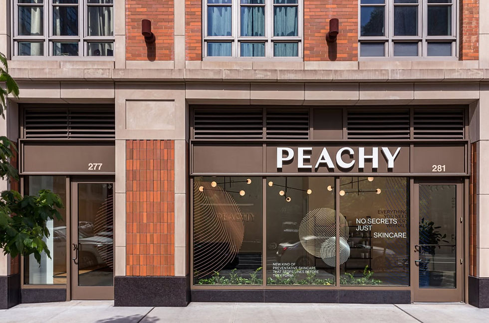
Founded in 2019 as a wrinkle-prevention studio, Peachy experienced rapid growth in 2021 after securing funding. However, this growth strained the booking flow, leading to issues in user flow, hierarchy, usability, and most importantly, retention.
Heyday
uses flexible, mobile-first patterns like pop-out menus and collapsible calendars—smart UI choices Peachy can adapt with its own brand and system.
Everbody’s
dynamic location selector improves booking flexibility by allowing multi-location searches, but its cluttered display could be streamlined for Peachy, especially when showing availability over multiple days.
Modern Age's
calendar shows one day at a time to reduce clutter, with easy navigation to other dates. Peachy could use this approach for time buckets, ensuring clarity with a help box and static time zone mention.
Facile
maximizes screen space by splitting it into two halves, offering an overview without scrolling. For Peachy, this could free up space for more features, but may not adapt well to mobile.
Bond Vet’s
filtering layout allows easy navigation of time slots and nearby locations. For Peachy, this approach could work well with time buckets, but a vertical layout would be more mobile-friendly.
Zocdoc’s
filter search, expanding slots, and filter buttons streamline booking. For Peachy, these could reduce dropoff and improve UX, but require careful design and testing to avoid complexity.
The kickoff
Stakeholder interviews were conducted with C-suite, VP of Growth, CX Team, Operations, Product Manager, Lead Engineer, and Creative Director to understand diverse business needs. A stakeholder analysis grid helped identify critical communication points.
Heyday
uses flexible, mobile-first patterns like pop-out menus and collapsible calendars—smart UI choices Peachy can adapt with its own brand and system.
Everbody’s
dynamic location selector improves booking flexibility by allowing multi-location searches, but its cluttered display could be streamlined for Peachy, especially when showing availability over multiple days.
Modern Age's
calendar shows one day at a time to reduce clutter, with easy navigation to other dates. Peachy could use this approach for time buckets, ensuring clarity with a help box and static time zone mention.
Facile
maximizes screen space by splitting it into two halves, offering an overview without scrolling. For Peachy, this could free up space for more features, but may not adapt well to mobile.
Bond Vet’s
filtering layout allows easy navigation of time slots and nearby locations. For Peachy, this approach could work well with time buckets, but a vertical layout would be more mobile-friendly.
Zocdoc’s
filter search, expanding slots, and filter buttons streamline booking. For Peachy, these could reduce dropoff and improve UX, but require careful design and testing to avoid complexity.
Early insights
Mixpanel revealed a significant drop between the "Schedule Appointment Screen" and "Enter Details Screen" particularly on mobile, which constituted two-thirds of bookings. User testing on 6 external users exposed issues like excessive clicking, scrolling, and lack of context, leading to frustration and drop-offs.
The response
Addressing user pain points, the focus shifted to visual hierarchy and componentry. Emphasis was also placed on accommodating additional features and enhancing data collection for business stakeholders.
Defining success
-
Enhance Mobile Screen Retention Rate.
-
Minimize User Interaction Pain Points.
-
Enhance Information Clarity.
-
Backend Data Enrichment.
-
Optimize Navigation and Minimize Redundancy.


Competitive analysis
With a clear understanding of our success metrics, my focus has been on comprehensively studying our competitors and analyzing booking flows employed by larger companies. The objective is to glean valuable insights that can enhance our own strategies.
Key insights
Optimizing mobile experience
Examining the success of Heyday's collapsible calendar, I identified an opportunity to enhance the mobile experience for two distinct user types: the Next-day Booker and the Return 3-Month Out Booker. Implementing a collapsible calendar can efficiently utilize screen real estate, especially for highlighting the current week's appointments. Users can toggle between an expanded view, allowing them to explore the full calendar and seamlessly scroll through months.
Unified chip filters
Observing the prevalence of chip filters across various platforms, we recognize the importance of adopting this user-friendly feature. Integrating chip filters can streamline the user experience and provide consistency across different interfaces.
Desktop calendar enhancement
Bringing a full calendar view to the desktop interface emerges as a potential improvement. This adjustment aims to facilitate easier navigation of appointments, offering users a comprehensive overview. Simultaneously, it clears up valuable screen space, allowing for a more organized display of appointments based on the time of day.


Leveraging market insights
By aligning our strategies with successful features identified in competitive analyses, we can refine our platform to better meet user needs and expectations.
User flow & information hierarchy
In the preliminary ideation phase, I delved into various iterations of the user flow, experimenting with different access points for screens, including the incorporation of slide-out drawer menus. Following a thorough examination of these options and gathering valuable in-house feedback, I ultimately chose to retain the current user flow. However, my focus shifted towards enhancing universal navigation and refining content hierarchy to optimize the overall user experience.


Mid-fidelity prototype
To test our assumptions, I moved forward to create a rapid wireframe prototype and validated it through concept testing sessions with users. Due to limited time constraints and resources, the testing was conducted with our in-house operations team and CX team.
Synthesis & analysis
Feedback received was generally positive and consistent. Leveraging a spreadsheet, I successfully categorized behavioral trends and identified outliers for further examination.
Key insights
High cognitive load
Users acknowledged improvements in the screens; however, concerns were raised regarding content overload. The need for simplification and reduction of information was highlighted.
Navigation issues
The hierarchy of navigation elements was not prominent enough, leading to a lack of clarity in the booking flow. Users struggled to find a clear exit point, indicating a need for enhanced navigational cues.
Chips
The sequence of information for Chip required reorganization. Prioritizing the Provider as the foremost detail, followed by Time, and concluding with Location, will enhance the user experience and align with user preferences.
Booking flow select appointment
A/B testing and Mixpanel tracking revealed significant improvements.
Key insights
Enhanced mobile screen retention rate
Achieved a 13% increase in conversions, surpassing the initial 10% goal.
Minimized user interaction pain points
Hotjar data indicated reduced time spent and fewer clicks on the screen.
Enhanced information clarity
In-house feedback validated improvements, albeit with time constraints.
Backend data enrichment
Introduced a new filter for time of day, providing clearer insights into user preferences.
Optimized navigation & minimized redundancy
Long-term strategies for new features, including out-of-state locations and a referral program, were planned during the redesign.


Built for what’s next
The project's success not only improved mobile retention but laid the groundwork for future growth, ensuring Peachy's Booking Flow can adapt to the company's expanding needs.
.jpg)

.jpg)

