LUCID
Overview Dashboard
Impact Measurement offers proprietary brand lift metrics and daily survey results through an always-on dashboard, enabling the measurement of digital campaign success and real-time optimization of media performance.

The backstory
In 2019, I embarked on Lucid's initiative to develop the product, Impact Measurement. Collaborating closely with a Product Manager and Engineer, we transformed an initial concept into reality within a nine-month timeframe, achieving market fit and orchestrating a successful launch. Following the launch, our focus shifted to enhancing user experience. This case study delves into the post-launch project journey.

The challenge
This project sought to tackle the feedback garnered from a prior research initiative focusing on market researchers' workflows. It was revealed that these professionals relied on multiple URL tabs to compare various key performance indicators (KPIs) throughout a campaign, a process that proved to be highly laborious and inefficient.
Goals
-
Provide a high-level view of campaign performance.
-
Enhance researchers' ability to extract actionable insights.
-
Improve contextualization of campaign metrics.
Role & collaboration
As Senior Product Designer, I led the product design work for this project in collaboration with a multidisciplinary team including an Associate Product Designer, UX Writer, Product Manager, Project Manager, and Front-End and Back-End Engineers.

Current high level overview of KPIs

Visual mockup
Building requirements
In anticipation of our kickoff call with stakeholders, I collaborated with the Product team to define our primary product requirements.
These requirements include:
Downloadable overview PDF
This feature aims to provide marketing researchers with a shareable campaign progress report in PDF format, facilitating seamless communication with their clients.
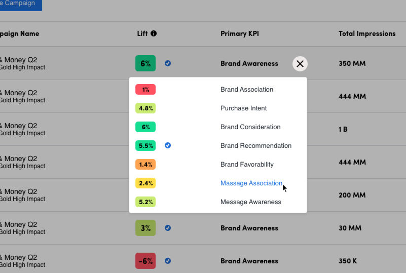
All KPI view
To address the challenge of scattered data, this feature consolidates all key performance indicators (KPIs) onto a single screen for simplified analysis and decision-making.
Campaign highlights
This functionality will offer a concise summary, empowering market researchers to effectively communicate the key performance aspects and narrative of a campaign's performance.
The kickoff
The kickoff meeting brought together key stakeholders, including the Product Team, the Engineering Team, the Project Manager, and the Product Design Team, to delineate the project's scope. Building upon our previous discussions regarding the product requirements, I crafted a visual representation illustrating the primary product challenges we aimed to address. This mock-up served as a valuable reference point during our meeting, aiding in the clear identification of what aspects fell within and outside the project scope.
Heyday uses flexible, mobile-first patterns like pop-out menus and collapsible calendars—smart UI choices Peachy can adapt with its own brand and system.
Everbody’s dynamic location selector improves booking flexibility by allowing multi-location searches, but its cluttered display could be streamlined for Peachy, especially when showing availability over multiple days.
Modern Age's calendar shows one day at a time to reduce clutter, with easy navigation to other dates. Peachy could use this approach for time buckets, ensuring clarity with a help box and static time zone mention.
Facile maximizes screen space by splitting it into two halves, offering an overview without scrolling. For Peachy, this could free up space for more features, but may not adapt well to mobile.
Bond Vet’s filtering layout allows easy navigation of time slots and nearby locations. For Peachy, this approach could work well with time buckets, but a vertical layout would be more mobile-friendly.
Zocdoc’s filter search, expanding slots, and filter buttons streamline booking. For Peachy, these could reduce dropoff and improve UX, but require careful design and testing to avoid complexity.


Client reports
To initiate the discovery phase, an audit was conducted on client decks from five key clients: Disney/Hulu, Roku, Mindshare, Qualtrics, and Kimberly-Clark. The primary objective of these audits was to delve into the language employed by market researchers to craft narratives for their clients, as well as to grasp the methodologies employed in conveying actionable insights and presenting data effectively.
Key insights
Utilization of color and symbols
Across the board, color schemes and symbols were employed as consistent tools for representing positive and negative information. This uniform approach aids in enhancing clarity and facilitating quick comprehension.
Prevalence of bar charts
Bar charts emerged as the predominant choice for data visualization, primarily due to their accessibility and ease of understanding for clients.
Preference for data tables
When presenting Key Performance Indicator (KPI) data, data tables were the most frequently utilized format. This format offers a structured and comprehensive overview, facilitating in-depth analysis and comparison of critical metrics.
Emphasis on plain language
Notably, when textual elements were incorporated, a preference for plain language was observed. This approach emphasizes clarity and simplicity, ensuring that clients can readily grasp the insights presented without unnecessary complexity.
Bridging client reporting and product design
By analyzing and synthesizing these key takeaways, valuable insights can be gleaned to inform the optimization of client reporting practices, thereby enhancing the efficacy of communication and the delivery of actionable insights.


Ideation
With a set of new features outlined in our product requirements and a wealth of research gathered from internal audits, our focus shifted to implementation. To facilitate this process effectively, I organized a series of workshops geared towards rapid, low-fidelity iteration of wireframes.
For the successful integration of these new features, it was imperative that our wireframes met the following criteria:
Key insights
Navigation consistency
Ensuring a seamless user experience necessitated consistency across global functions and navigational bars. By streamlining these elements, we aimed to enhance usability and reduce friction in navigation.
Reduce cognitive load
To alleviate cognitive load on users, we strived to cultivate a uniform experience across Overview and KPI pages. This approach aimed to enhance user familiarity and facilitate smoother navigation through the platform.
Evaluate page hierarchy
Assessing the placement and hierarchy of page elements within the context of new features was critical. By conducting thorough evaluations, we aimed to optimize user engagement and ensure intuitive interaction with the platform.
From insights to ideas
By adhering to these principles during the wireframing process, we aimed to lay a solid foundation for the successful implementation of our new features, prioritizing user experience and usability at every stage of development.


Mid-fidelity prototype development
In order to validate our Information Architecture (IA) assumptions, we proceeded by crafting a mid-fidelity wireframe prototype for subsequent validation through concept testing sessions with our current user base.
This prototype introduces the new Campaign Overview Page, designed as a high-level dashboard providing insights into ad campaigns, tailored for market researchers.
Key insights:
Global navigation
Our primary objective was to enhance the global function and navigational bars to ensure consistency throughout the platform. To achieve this, we incorporated a new submenu to facilitate smoother navigation within the campaign interface.
Reduce cognitive load
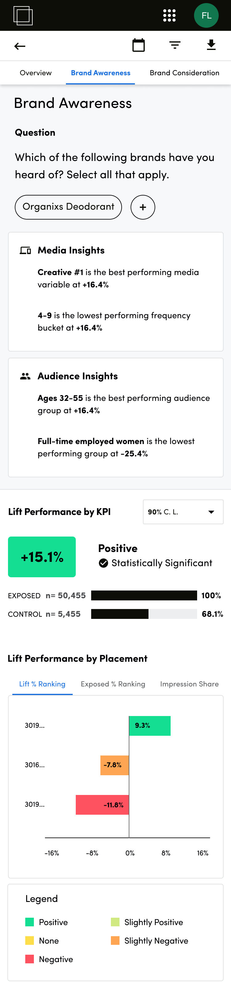
Secondly, we aimed to create a unified user experience across the Overview and Key Performance Indicator (KPI) pages, with the intent of reducing cognitive load on users. This objective is manifested in the consistent presentation of data, notably represented through bar graphs on both Overview and KPI screens.
Page hierarchy
Lastly, our focus was on evaluating the placement of page elements and establishing a clear page hierarchy for new features. The screens you are viewing have been meticulously structured to prioritize information from a hierarchical standpoint. Beginning with high-level data at the top, followed by progressively detailed insights further down the page. For instance, the Campaign Insights section, as a newly introduced feature offering a swift breakdown of KPI performance, is strategically positioned towards the top of the screen to provide users with an immediate overview.


Concept testing
Following the development of our Mid-Fidelity Wireframes, we proceeded with concept testing. This phase involved moderated remote sessions conducted with three current users, comprising Disney, Mindshare, and Roku.
Synthesis & analysis
Utilizing insights gleaned from user interviews, we employed Dovetail as our qualitative data tracking tool to organize and analyze the collected data comprehensively. Leveraging interview tagging features within Dovetail facilitated the extraction of key information, which was subsequently imported into Figjam for in-depth analysis and strategic planning.
Key takeaways:
Campaign insights
While campaign insights provided a promising foundation, concerns were raised regarding its practical utility and effectiveness.
KPI overview vs. breakouts
It became evident that the KPI breakout alone does not serve as the predominant method for researchers to assess campaign performance thoroughly.
Campaign level breakouts
There exists a clear need among researchers for a systematic approach to evaluate campaigns based on demographic parameters and tailored custom breakouts.
The new overview & updated KPI screens
Designed to streamline the market researcher’s workflow, the new Overview screen offers a high-level snapshot of all KPIs in a single view—enhancing clarity, efficiency, and client communication.
Key insights
Enhanced metadata on the overview screen
Recognizing the importance of real-time data access during client interactions, we incorporated additional metadata based on user feedback. This includes features such as "last updated" and "Total Completes," aiding users in identifying clients, campaign status, and progress.
Improved scannability and scalability
We optimized the presentation of Key Performance Indicators (KPIs) by introducing a table view. This format enhances scannability, facilitating quick comprehension of data from left to right or top to bottom. Moreover, the transition to a table format from the initial card layout ensured scalability, enabling seamless expansion of datasets.
Expanded campaign-level data
Responding to consensus feedback from interviews, we augmented the display of campaign-level data. This enhancement involved the integration of additional overview graphs, utilizing both bar charts and tables. This empowers users to customize and articulate data narratives more effectively to their clients.
Improved answer data visibility
In addressing the need for improved visibility and transparency, we redesigned the presentation of answer responses. The introduction of filterable chips across the page replaced the previous dropdown menu approach. This modification enhances user interaction with the data, ensuring clarity and accessibility.
Consistency in visualization
To streamline the user experience and reduce cognitive load, we aligned the visualization style across pages. By transitioning exposed and control bar charts from vertical to horizontal orientation, we maintained consistency with the overview page. This cohesive design approach enhances usability and navigation between different sections of the interface.


What’s next
Impact Measurement not only served market researchers but also became a flagship product for Lucid. Its visually consumer-friendly design facilitated its use in pitch decks, culminating in its acquisition by Cint in 2021.
This case study underscores the iterative process of understanding user needs, refining design solutions, and ultimately delivering a product that drives measurable impact.
.jpg)
.jpg)

